Update: Sites like Squarespace and Wix seem to have tackled a lot of these issues. This may be a good route to go for many artists to go. There may be a use for Boomshaka in the future, but for now this project is on hold. Thanks for your interest!
When you really get down to it, WordPress can be frustrating for image based designs. I’ve been using WordPress since 2008 and have helped many artists with their websites. I see a lot of the same problems. Navigation can be overly complicated and take too many clicks to see images. Images and galleries usually only look good on large monitors. Lightbox plugins look cool but they complicate analytics. Those are some of the big ones and those situations don’t even include e-commerce which complicates things even more.
I recently teamed up with master coder Jordan Kanter (also a longtime friend) to embark on designing a theme from scratch. We figured that given our knowledge we could design out a lot of common problems that we had noticed.
We’ve been working hard for the past three months. Today, I’m pleased to present the first live version of that code, which we call Boomshaka. You’re actually looking at it right now on this website. We saved a lot of time by using the amazing codebase from the underscores theme (thanks guys!).
We are currently in Beta testing and accepting applicants. As of this post, the Boomshaka theme has grown to solve more problems than initially intended. Here are some of the big ones:
responsive design and adaptive images (mobile and tablet friendly)
artist oriented usage of WordPress (rather than blogger oriented)
e-commerce ready (WooCommerce supported)
analytics on everything
easily (but not annoyingly) sharable
handicapped accessible
robust styles – allowing for easy browser minimize/maximize functions
If you would like a new beautiful website that uses our code we’re ready to help. We can also accommodate existing WordPress users with transitioning their site. Also If you have any feedback on the project we’d love to hear from you.
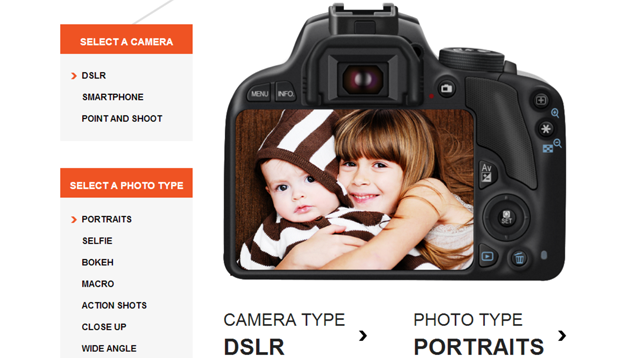
The most simple photography tips can make a big difference when you’re trying to capture a special moment. This guide from Shutterfly offers tips for smartphones and cameras, across a range of photo types.
Here are 6 Scanning Tips from an Artist that will help you get the best possible scan for your buck. These points will apply to any scan wether the desired output is a fine art print or an instagram.
Before you scan, clean the scanner bed. This will help cut down image editing later on. There is dust on the scanner bed even if you can’t see it. (Detailed instructions on cleaning the glass here)
Scan in high resolution. If you plan on printing later on your images should be at least 300 dpi. If you want to print larger than your source material you will need to scan larger than 300 dpi.
Scan more area than what you need. This leaves some room for error. You’ll be especially happy you did this if you need to rotate the image later on.
Keep a copy of the original scans so you can revert back if necessary. An extra pro tip would be to keep whatever source material for your scan as well. If there are problems with the scan then you could do a rescan later on.
Beware of level clipping. Some scanner software is horrible and you have to make sure it doesn’t blow out the highs and lows.
Don’t have the scanner software do anything fancy if you don’t know what you are doing. There are some settings the scanner understand what type of material it is scanning. These settings are good. There are a lot of other potential adjustments that will actually degrade your image. Real image editing and enhancements should be saved for post production in Photoshop.
Here are some tips for submitting your work to galleries and to get your submission the attention it deserves. I’ve looked at thousands and thousands of submissions by artists and I’ve noticed some reoccurring issues.
Read any directions for submitting work. This may seem too obvious to mention but you would be surprised how many times I have looked over incomplete submissions. Directions for submissions are in place to consolidate the interaction and to give the reviewer the best chance for making a good decision for their organization.
Personalize your submission to each specific gallery. A lot of people buy bulk lists and blast their submission to every nook and cranny on the internet. I received many submissions to our abstract gallery by artists working in figure painting. It was obvious who was familiar with the kind of work that we showed, and those who were not. Make sure you are sending a quality submission and not just spamming gallery owners.
Don’t demand an answer. People may disagree with me on this one and that is fine. I understand that submitting work can be anxiety provoking and sometimes it seems that hearing a definitive yes or no is priority number one. I think this is being shortsighted. One scenario that submissions fell into was of “not right now.” These were artists whose work I genuinely liked, however given the current lineup of shows and artists the work just wouldn’t fit in the near future. When these artists demanded an answer, I was forced to say “no” when in reality the answer was “not right now.”
Here is a guide to photographing artwork (2d and 3d). It’s the best one I’ve found and has been very helpful to me in photographing my own work and others. It covers beginner topics as well as advanced. http://www.dallasartsrevue.com/resources/How-to-Photo-Art.shtml
If your art involves color, shape, dimension or texture, direct sunlight is the best light source, and it is widely available on this planet. Not talking about full — or open — shade (illuminated by the overly blue sky above), not dappled light (like from a tree’s varying shadows), not overcast sky light (when the sun goes behind a cloud), but direct light beamed down 93 million miles from our local star.
Direct sunlight, however, is not always available, and other natural and unnatural light sources have their qualities, too. (See Other Light, below.) They’re just not as good nor cheap nor easy to deal with as the light from the sun.
I’ve looked through thousands and thousands of artist websites. I’ve noticed that I am drawn to certain types of sites. I have also noticed many common issues from website to website. For instance, website navigation can become very confusing in artist websites. At Park Schreck Gallery, I started putting these thoughts into writing. I began a series called Examining Artist Websites
At the gallery, whether we were reviewing submissions or researching referrals, the way artists presented themselves online became a distinguishing factor in our selection process. Artist websites are the primary way artists present their work today just like slides were the submission standard of the past
Of course there is no one way of doing things and my reactions may not be the same as other curators. Despite this, I think hearing the thoughts of someone who has looked through so many websites could be revealing. This is especially true for new site designers and artists just starting out with their 2nd or 3rd website.
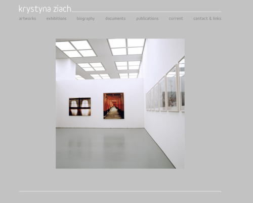
Examining Artist Websites 001
Everyday at Park Schreck Gallery we look at artist websites. Sometimes websites stand out to us for design, clarity, and focus.
Thoughts on the site: Her website is very clean with a well thought out layout. The images are crisp but small enough so that they load quickly. The navigation, text, and subtexts do not take away focus from the artwork. Oh, and the artwork is wonderful. Nice work Krystyna!
Examining Artist Websites 002
Everyday at Park Schreck Gallery we look at artist websites. Sometimes websites stand out to us for design, clarity, and focus.
Before we get started, if you’re having trouble reading German, visit google translate. These days it is very easy to translate a website without disrupting formatting.
Thoughts on the site: The layout is very straightforward. Navigating through the different “Books” took a few seconds to figure out. Horizontal scrolling is disabled. Clicking once on each image acts as a “page turn”… which may actually be a cleaner way of navigating.
The images look stunning. They are quick-loading and clearly optimized for web viewing. What I like even more is that there are “Installation shots” of gallery exhibitions. Sometimes images can be deceiving (especially on the internet) so being able to see the artwork in context helps me trust even more the images that I was previously drooling at. Thumbs up.
Side note: one possible drawback to viewing websites in other languages is that only text can be translated. If there is any “text” information in a picture, that information is unable to be translated. This may be worth considering if your website has a lot of flier images, or exhibition postcards. Your viewers in other languages will not be able to “read” these images. A possible solution would be to re-type any information below in an image caption.
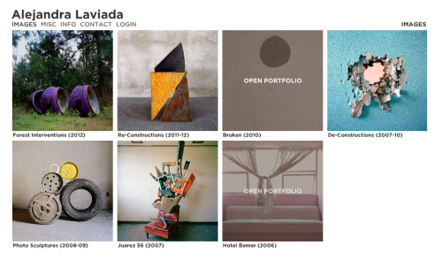
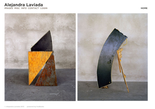
Examining Artist Websites 003
Everyday at Park Schreck Gallery we look at artist websites. Sometimes websites stand out to us for design, clarity, and focus.
Thoughts on the site: The welcome page (1st image) on the website has very powerful imagery which draws me into the site. This reminds me how powerful one image can be. This “intro” image, if you use one, is something you want to get right.
I notice that the artist is using a portfolio generator service called liveBooks which uses Flash. These services a huge benefit in that they can provide solutions to common issues that arise in visual based websites. One of the drawbacks can be limits on customization and recognizable layout. This is my first encounter with liveBooks and I am impressed with how clean it is.
I like how the “Images” page works, the true portfolio section of the website. This page is very clean with crisp images along with the titles. The titles, however, are sized very well in that they don’t distract at all from the images. I
Aside from some weird menu animations, the site is slick! Nice work.
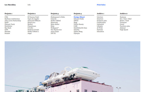
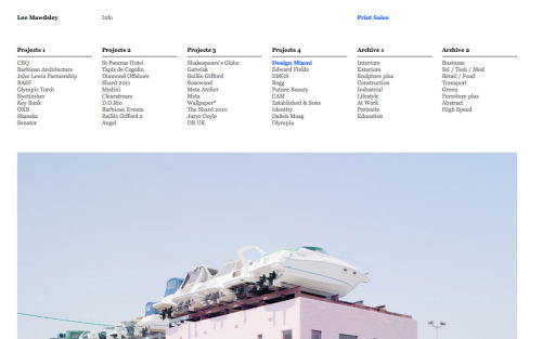
Examining Artist Websites 004
Everyday at Park Schreck Gallery we look at artist websites. Sometimes websites stand out to us for design, clarity, and focus.
Thoughts on the site: This website is one of the best portfolio websites I’ve ever seen. Actually, I think it spiritualizes a lot of the common problems associated with portfolio websites. I’ll fire through this quickly.
The menu/navigation is easy to understand and is always at the top of the page. The navigation doesn’t disappear, it is always there.
The layout of the site is only one layer deep. In other words, every page can be directly accessed from the navigation. This gives a “what you see is what you get” sense of ease. The website is constructed for ease of use.
The images are plentiful and wonderful. There are no inferior images on the website. There are no thumbnails. You can instantly click on any project and are rewarded with A TON of amazing images.
If you really want to kick your feet up you can click any image on the bottom right hand corner. This will transport you into a totally efficient and intuitive full-screen mode.
The truth is, I’ve known about Lee’s website for sometime. It was featured in an article titled 20 Great Artist Portfolios Built With Indexhibit. I often refer artists to this website to get a sense of some of the truly amazing possibilities when it comes to making a portfolio website.
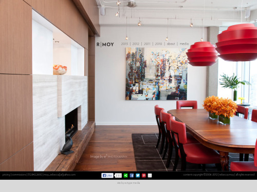
Examining Artist Websites 005
Everyday at Park Schreck Gallery we look at artist websites. Sometimes websites stand out to us for design, clarity, and focus.
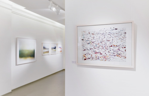
Today’s artist is located in Chicago: Rebecca Moy (disclosure: Rebecca shows her work at Park Schreck Gallery)
Thoughts on the site: The homepage for Rebecca’s site features an amazing installation photograph of one of her paintings in a highly designed room. The photograph is breathtaking and gives you the highly desired “wow” effect. This image sets the tone for the rest of the website experience.
Visuals are king on her site, as it should be. Any text on the site is small and never conflicts or dominates the visuals.
Layout is simple and straightforward. Minimal amount of scrolling required. Rebecca utilizes a slideshow tool to handle portfolio images in a one-at-a-time manner. Social media buttons make the website easily shareable.
The website on a whole is great. Again, standout features are the homepage image, the straightforward layout, and the overall focus on the Image.